Negative Space in Design
Creating a visually clean design, forming a conceptual unity between objects and design elements.
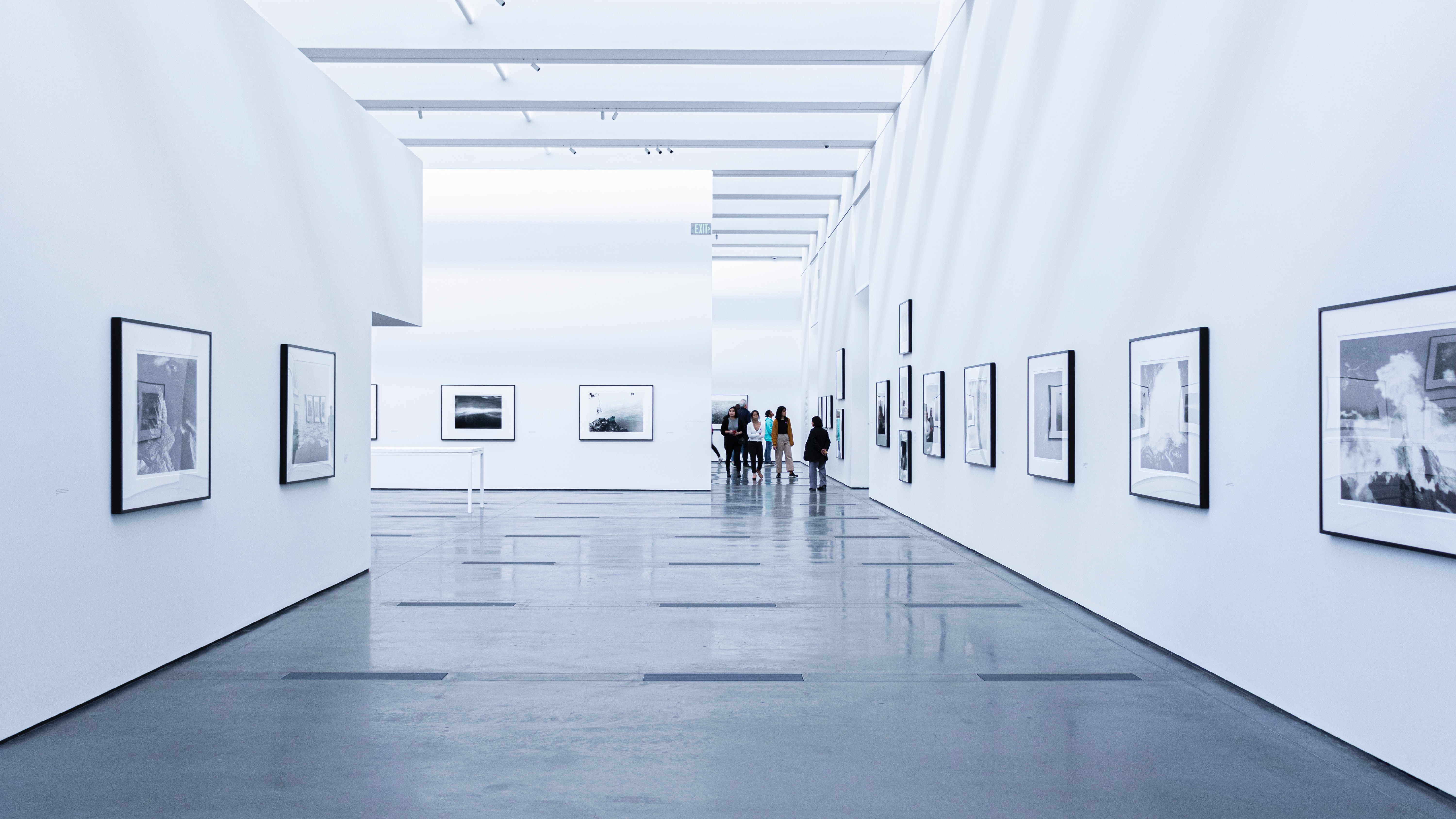
The negative space is an essential component of designing a layout that is both beautiful and usable. Also known as white space in interface design is the space between multiple design components or elements in a layout, which helps to create visual clarity and uniformity, as the brain is at ease viewing layouts on the design interface.
Negative space in any good design is an integral part of visual aesthetics, it gives elements breathing room; it sorts out the clutter and it spaces out the elements in the design. In websites and mobile apps UI designs, the negative space is used to achieve better usability and interaction of the interface. It also helps to reduce the density of UI elements on the screen.
As a design tool, the Negative space is widely used in webpages and mobile application designs strategically to aid the utilization of content. The purpose of properly used white space is to allow the eye to move easily around the screen, without feeling empty or requiring unnecessary scrolling and navigation to view important content. Naturally, the eye is drawn more to elements with more negative space around an object within the layout.
Types of Negative Space
Micro space is the negative space between smaller elements or around the layout elements. This includes space between text lines, paragraphs, icons, and buttons.
Macro space is the space between elements and the inside, is the large space between major layout elements, and the space surrounding the design layout which also refers to margins and paddings.
Passive space is the unnoticed space around the elements or objects.
Active space is draw a user’s attention and emphasizes elements like a headline, icons, logo, or graphic.
Using Negative Space in Design
The negative space is essential to create and design visual interest and good composition.
Sense of Rhythm: Negative space helps the viewer’s eye navigate the layout, creating a sense of rhythm and movement through multiple visual elements.
Harmony: Negative space help draw attention to the central focus elements. It balances out the overall layout space so that a visual piece does not overwhelm viewers.
Focus: It allows the viewer to clarify and enhance the focal point immediately.
Negative Space in Design
Creating a visually clean design, forming a conceptual unity between objects and design elements.
By Wicar Akhtar
The negative space is an essential component of designing a layout that is both beautiful and usable. Also known as white space in interface design is the space between multiple design components or elements in a layout, which helps to create visual clarity and uniformity, as the brain is at ease viewing layouts on the design interface.
Negative space in any good design is an integral part of visual aesthetics, it gives elements breathing room; it sorts out the clutter and it spaces out the elements in the design. In websites and mobile apps UI designs, the negative space is used to achieve better usability and interaction of the interface. It also helps to reduce the density of UI elements on the screen.
As a design tool, the Negative space is widely used in webpages and mobile application designs strategically to aid the utilization of content. The purpose of properly used white space is to allow the eye to move easily around the screen, without feeling empty or requiring unnecessary scrolling and navigation to view important content. Naturally, the eye is drawn more to elements with more negative space around an object within the layout.
Types of Negative Space
Micro space is the negative space between smaller elements or around the layout elements. This includes space between text lines, paragraphs, icons, and buttons.
Macro space is the space between elements and the inside, is the large space between major layout elements, and the space surrounding the design layout which also refers to margins and paddings.
Passive space is the unnoticed space around the elements or objects.
Active space is draw a user’s attention and emphasizes elements like a headline, icons, logo, or graphic.
Using Negative Space in Design
The negative space is essential to create and design visual interest and good composition.
Sense of Rhythm: Negative space helps the viewer’s eye navigate the layout, creating a sense of rhythm and movement through multiple visual elements.
Harmony: Negative space help draw attention to the central focus elements. It balances out the overall layout space so that a visual piece does not overwhelm viewers.
Focus: It allows the viewer to clarify and enhance the focal point immediately.